I published my very first novel–that I wrote in the early 1990s–with a default Amazon eBook cover. I was still pretty excited to have The Sleepless Nanny out in the world, but when my dear friend Paul Steed loved the book so much he volunteered to create a “real” cover for it, well that was just amazing. For the first Lexy Cooper book, serendipity or fate or something put me together with Brett Parson, who has done five Lexy covers and has agreed to do Lexy #4 this coming spring.

Brett’s interpretation is a big part of who Lexy is. I can’t imagine having anyone else do a Lexy cover (though I almost had to once–a harrowing tale you can read here).
But then I decided to give Lexy’s co-protagonist Detective Mike Malick a spin-off series. One in which he would do his homicide detective thing unencumbered by video game stuff. As much as I love Brett’s work, Malick needed his own signature look. Something completely different in style. So, I approached a great friend of mine, Sarah Nicholson. Several years ago we founded a group for women gamers–Xbox GamerchiX–that at one point had over 10,000 members. So she and I go back quite a ways. She also happens to be an amazing artist/graphic designer.
This is how our first conversation went:

Now, if you’ve read any of the Lexy books you know that Malick is a bit of a throwback. He likes his drinks straight up and his women without strings attached. He still reads the newspaper, and listens to the Rat Pack. His first novel, Summer Wind, shares its title with a Frank Sinatra song (and so will the next two books in the series. Shhhh….).
Here’s a passage from the upcoming book:
After the meeting breaks up, I put in ninety minutes at the gym. Sinatra at the Sands with Count Basie makes the time slip by quickly. As I unclip the mp3 player, I get a look at the album cover and deeply regret the era in which I live—a time when a man can’t wear a hat without looking like a tool or a hipster. Because I’d look damn good in a classic fedora.
See? This book is written in the first-person. There aren’t alternating chapters in Lexy’s P.O.V. or any of the other characters. It’s all Malick all the time. Another reason this series needed its own distinctive cover style.
As Sara and I worked out ideas for Summer Wind, we kept in mind that this was the start of a new series, so the style should be able to carry over to new plots while maintaining that Abstract Noir feel. I showed her a series of covers I’ve always admired: the Ruth Rendell paperbacks from the eighties. Dark background, lurid color, and the focus on a single object. And the drip–always the drip.

So, armed with “abstract noir” and the knowledge that the book is about the death of a grunge rock star, Sara came up with two concepts:

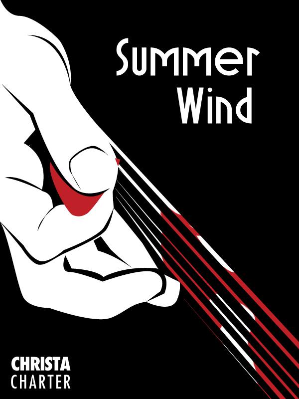
Bloody guitars? Hell yeah!! We went with the first version–it had more movement and said “rock and roll” more than the guitar pick one. Sara refined the art and the font and the final cover looks like this:

And, since a paperback will follow the eBook in a few months, here is the front and back. I absolutely love how she used the Seattle skyline to give the book a sense of place.

Summer Wind comes out a week from today, on 11/11. You can preorder it now or snap it up next Tuesday! I sure hope that Sara will do the cover for the next Mike Malick book: You Go To My Head, but in the meantime if you’re looking for a truly gifted UI/UX designer who is a hilarious joy to work with…

1 Comment